Top 10 Design Tools That Will Simplify Your Design Process
Accept nothing less than the best
It’s natural to pause at the year’s end and think about what we’ve accomplished and learned. Now is the time to reflect on our progress thus far and think about ways to enhance our efforts moving forward. Similarly, I’ve been contemplating the many design tools that have improved my workflow and forced me to think outside the box.
Thanks to these tools, which range from user-friendly software to carefully crafted templates, I’ve approached my work with a newfound level of sophistication and nuance. These programmes have given me the means to skillfully and precisely implement my ideas, whether working on an illustration or a comprehensive branding strategy.
In addition to their utility, these resources have also sparked a sense of curiosity, encouraging me to explore new design methodologies and techniques.
So without further ado, Let’s dive in.
xTiles

It is a fantastic tool that allows you to create a visual workspace for your ideas and projects. I created my dashboard in xTiles, which combines all my plans for the year/month/week, work projects, and all the notes I need to return to later. I appreciate the quick notes feature. It instantly syncs my notes from the mobile app to the web version. It’s perfect for people who need extra context and want to see the bigger picture to support their thinking, writing, or creativity.
Creatives love it for its simplicity and flexibility. So whether you’re a writer, artist, designer, or just someone with many ideas floating around in your head, xTiles is the perfect tool to help you stay organized and on track
Built for mars

Built for Mars are a renowned UX consultancy and a wealth of knowledge. With over 10000 hours of research compiled into 54 case studies, it is like a UX university without the fees.
They cover a wide range of topics and provide in-depth analysis from experts in the field.
They delve into the design and user experience elements contributing to the app’s high ratings and popularity. One example of their case studies is their analysis of an iOS app with an average rating of 4.9 stars after 500,000 reviews. So, they broke down what makes this app so successful.
Reading these case studies, you can understand what it takes to create a successful product and apply those lessons to your work.
Absurd Illustrations

If you want to add some whimsy and quirkiness to your projects, absurd illustrations are just what you need.
Their surrealist vector artworks are perfect for livening up websites, presentations, apps, and articles. These illustrations bring a touch of paradox and playfulness to any project.
Whether you want to add some quirk to your landing page or inject humour into your app, our absurd illustrations will surely fit the bill.
3D Transformer

As the name suggests, 3D transformed lets you turn any image into a beautiful 3D mockup with just a few clicks. It also comes with a Figma plugin, so you can quickly turn any frame into a stunning 3D mockup.
Design systems for Figma

This is a collection of popular design systems from all over the world, each backed by code for easy implementation.
Featuring design systems from top companies like Spotify and Uber, you can access tried and tested templates and guidelines to ensure consistent branding and design across your projects. And if you need extra guidance, they have a fantastic blog with a wide range of discussions on design systems.
Userbrain

Userbrain cloud-based platform is designed to help businesses measure and validate customer experiences through continuous feedback. With features like issue tracking, tagging, access control, and task management, you’ll have everything you need to ensure your customers have the best possible experience.

It also allows you to target specific audiences based on demographics like gender, age, and location and create custom test scenarios to get a feel for how your customers use your product.
If you need more than that, it also lets you automate your user testing schedule and even conduct periodic tests to ensure your customer experience is always top-notch.
Kickass UX

Kickass UX’s mission is to reinvent UX design education and give you the skills and resources you need to thrive in your career.
Their team is dedicated to helping you excel at overcoming stakeholder subjectivity so you can make a significant impact in your field.

In their UX library, you’ll find a wealth of helpful articles and case studies to help you stay up-to-date on the latest trends and best practices. They also offer free templates to help you fast-track your work and save time.
And that’s not all — they also have UX kits and other helpful resources to make your journey to becoming a top-notch UI/UX designer easier.
A stream of brands - ASOB

Are you a brand designer or someone who loves staying up-to-date with the latest visual identities? ASOB is a collection of unique visual identities. They curate the best creative works into carefully documented galleries.
But ASOB isn’t just for staying in the know — it’s also a comprehensive brand design library meant to inspire the creatives shaping the brands of tomorrow. You can use it to explore the library of visual identities, find inspiration for your next project and discover new typefaces,
Superflow

Superflow has a vast library of styled Webflow components.
With Superflow, you can easily copy and paste a component into your project and customize it to fit your branding. No more wasted time on cloning templates — choose from their massive selection of components and work on creating the perfect website for your business.
Apple & Banana

It is a publication dedicated to making every UX research study more easily incorporated into your projects. They understand that research in the real world can be messy, so they provide practical guidance to help you navigate it.
And the best part? Their publication is loved and recognized by researchers all around the globe, from big tech companies to small teams. So join the thousands of others and make your research fruitful with Apple & Banana.
How exactly do product manager and UX designer collaborate?
What’s the difference between a UX designer and a product manager? When both roles are on the team, they often wonder where each other’s responsibilities start and end.

I’m writing this from a UX perspective, but sometimes a professional may start in one role and work in the other. Some job duties overlap. It’s common to meet a product manager that started as a UXer or vice versa. When I compare these roles, I see clear-cut responsibilities. For example, a Product Manager has typically led prioritising feature requests.
Let’s examine why they are the perfect match for the product team. Then, some responsibilities are murky. Who makes personas? Who owns User Research? I’ve seen it at one company as the PM, another UX, and another Marketing—the same story.
In practice, there’s quite a bit of overlap between these two roles. This can cause friction for some, but under the right conditions, having both product managers and UX designers on the same team creates some of the most successful products and services.
People in each of these roles often come from various backgrounds. On the one hand, you have UX from graphic design, art, or even business and technology backgrounds. Product managers also come from multiple experiences, such as business or technology; in fact, many UX designers end up moving into product management!
If you read different job descriptions, you’ll start to see a lot of overlap in significant responsibilities:

It's not about roles; it's about skills.
I've found that defining roles matters less than how a company operates.
Highly collaborative teams have Product Managers and UX Designers assigning each other tasks based on what they need for the project. Whoever is best suited at that moment to do it does it. Sometimes the UX Designer might be doing research; other times, the PM, and hopefully, they will work on it more often. Everyone can move forward without feeling territorial.
We must realise that both Product Managers and UX Designers are essential, but they can make decisions together. If these two roles do not share responsibilities, you will have a disconnect between your team and product.
Product Management with no User Experience Design creates functional products that don’t make users excited. User Experience Design with no Product Management produces delightful products that don’t become businesses.
The overlap between UX and product management
A great deal of shared responsibility lies between UX designers and product managers.
Both people focus on solving customer problems through the product they are creating. It brings us to the first point of overlap between the two roles… defining the problem.
UX designers and product managers actively define the problems the product and features are solving for its customers. This work happens most effectively when product managers and UX collaborate.
Product managers are charged with meeting specific business goals through product development. To do this requires defining which problems to solve for customers that will also meet these key business objectives. For UX designers, the overlap occurs when they collaborate with product managers to define further those chosen problems to solve with a deeper understanding of the design and user implications of solving them.
The next area of overlap exists in understanding the product’s customer (or users). Both product managers and user experience designers should conduct and participate in user research. Whether interviews, usability tests or field study observations, each role is critical in learning more about the customers and creating key insights from user research.
Collaborating on a solution is the most significant overlap between UX and PM. Whether creating concepts, journey flows, or prototypes, these roles often work together to paint a picture of the solution for the customer. From there, iterating on that solution in the early stages or even post-launch is another shared responsibility between both roles.

User experience and product management are mutually reliant.
Innovation never occurs in a vacuum.
Making a fantastic product for customers requires a well-functioning team with the correct abilities and a positive dynamic among its members. The success of a product or service depends on the collaboration, communication, and understanding of the product’s creators and management. The most effective product managers appreciate the importance of user experience design, design thinking, and the work of product designers. In contrast, the most effective product designers understand the goals and roles of product managers and always strive for mutually beneficial partnerships.
How is video commerce a powerful tool for shopping?
How we consume video online has evolved so fast that it’s made my head spin.
Online videos featuring products and brands help consumers make purchasing decisions online. Modern-day consumers have grown to rely on video in their online shopping.
Video affects 64% of purchases made online.
In 2014, consumers who viewed videos were up to 3.3 times more likely to make online purchases. This is especially true for consumers who shopped from online-only retailers.
The demand for video product reviews, tutorials, how-to’s, unboxing, and comparison videos was exceptionally high during the 2014 winter holiday when most gift purchases occurred.
52% of consumers stated that watching product videos made them more confident shopping online.
Here are some interesting facts that need attention:
- Mobile video consumption is almost doubling with every passing year
- By 2020, video traffic will represent around 80–90% of the global consumer internet traffic
- videos will contribute 80% of all web traffic
What does this indicate?
Video commerce is the next big thing in marketing. But How Videos on Product Pages Can Increase the Conversion Rate of E-commerce Websites differs from what I will discuss, but how to implement it best in your existing products and the real-time problems faced.
Heuristic Evaluations
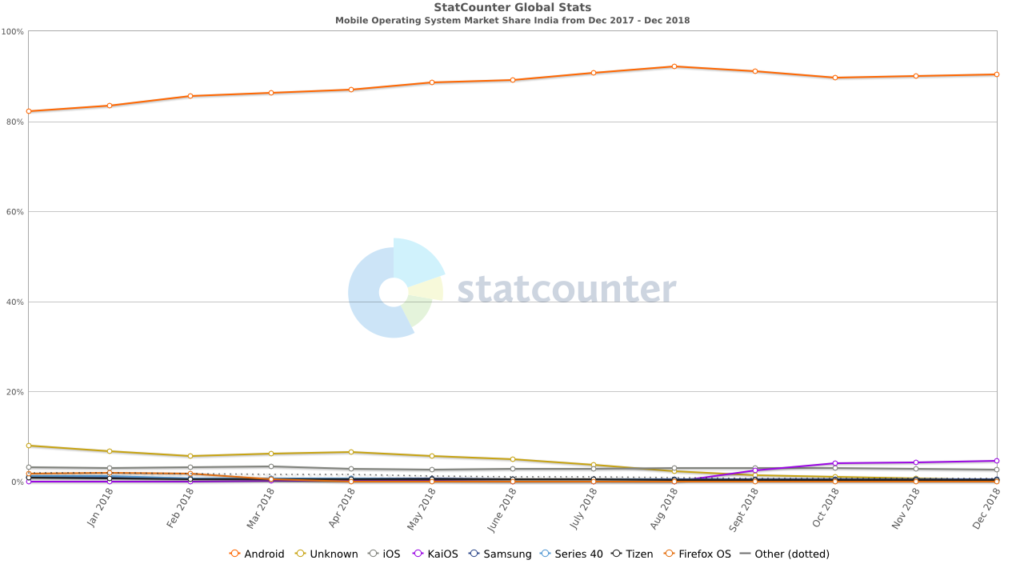
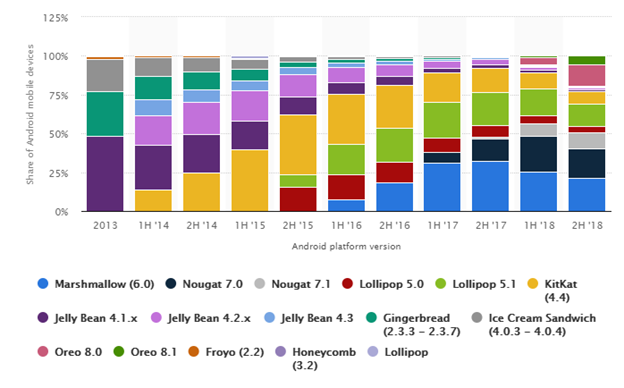
Android’s dominance in the Indian smartphone industry is echoed globally. The operating system held over 80 per cent of the smartphone market as of the fourth quarter of 2016. There will be an estimated 107.7 million Android users in the U.S. alone in 2016, compared to 87.7 million in 2014.
Android version market share distribution among smartphone owners as of September 2018
Contextual Research
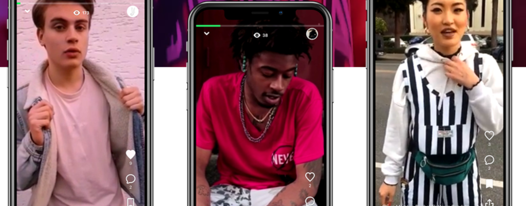
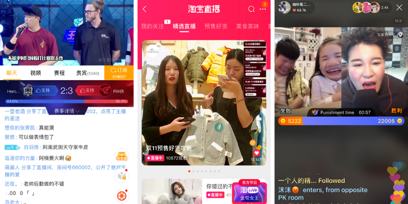
Yeay is a young marketplace that facilitates buying, selling and discovering new products from around the globe through its video feeds. It brings in an excellent concept of creating full-screen vertical videos that are fun and creative. Users can swipe up the video to shop for the product showcased in the video.
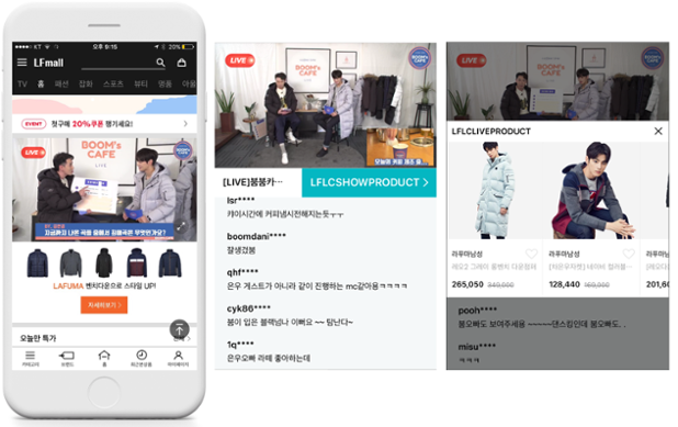
E-commerce companies like Taobao and JD.com have been experimenting with video to engage and attract buyers to their platforms. Both companies have included live-streaming functions in their apps, allowing merchants to show potential buyers their wares and even offer discounts while interacting with viewers in real-time. Both have also launched short video functions within the e-commerce platforms.
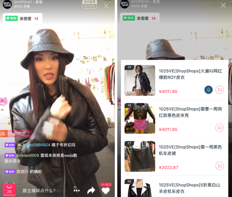
In terms of the user interface, Lu Ke resembles Tik Tok. One slight difference is that Lu Ke focuses more on providing users with a question-and-answer platform and an e-commerce shopping guide. Video length parameters and tools for interacting with other users are similar to the market leader. Questions can be added to videos with the option to invite others to give responses. Users can also choose questions that they would like to answer.
Global brands are jumping on the trend. A study by consumer research group L2 showed that two-thirds of beauty brands in China had held live-streaming events on Tmall. While the fashion and beauty industries are leading the charge, live streaming is an opportunity for any industry. From luxury cars to French infant milk powder, brands are experiencing significant results, and it has become a regular part of their marketing mix.
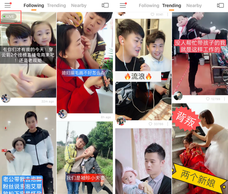
E-commerce live streaming is one of the most critical potential growth areas for the live streaming industry in China. Several entertainment live-streaming apps, including Momo, Yizhibo, and Kuaishou, have incorporated e-commerce functionalities.

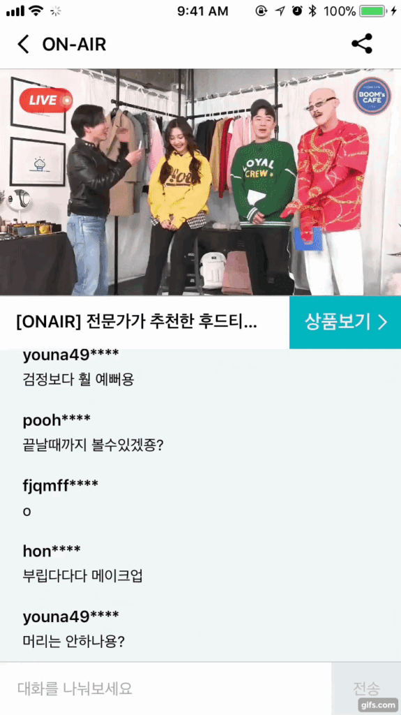
Womanstalk, “Korea’s first video commerce platform,” also comes aboard as the CSP (Commerce Service Provider). On Womanstalk, Suppliers are provided with video content produced by influencers — and in turn, suppliers list their products at the lowest price.
In 2017, Kuaishou was China’s most famous short video streaming app, with over 20 per cent market share, according to a December report by Chinese data provider Jiguang. According to a report released in January 2018, Kuaishou had 700 million registered users and over 100 million DAU.
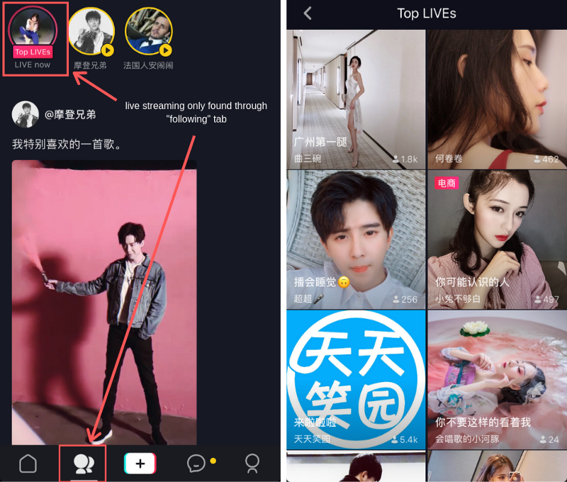
Douyin has been one of the hottest short-video apps in China this year. It is a trendy short video platform owned by Bytedance. The international version of Douyin is called Tik Tok.
While Douyin has live-streaming features, it has yet to expand them as much as it initially said it might, so while some call it a live-streaming platform, I would categorise it as a short video platform.
Personas
Millennials are comfortable using videos in online shopping.
- 4 in 5 millennial shoppers find online product videos helpful when researching future purchases. — Animoto
- 67% of millennials are confident they can find a video on YouTube about anything, including product video reviews. — Think With Google
- Millennials are 146% more likely to watch videos on a retailer’s website during online shopping than older consumers. — Animoto
- Gen Y shoppers are 264% more likely to share product videos while doing online shopping. — Animoto
- Three-quarters of millennials rely on online video when comparison shopping. — Animoto
- 69% of millennial shoppers turn to online video content to research complementary products to add to their purchases. — Animoto
Shoppers watch product videos on the go.
- 50% of global YoutTube viewership comes from mobile devices. — Think With Google
- By 2019, 72% of mobile traffic will be online video content. — Cisco
- Mobile video viewers are 1.2 times more likely to think highly of companies offering product videos on their pages. — Think With Google
- Millennials who use mobile devices to watch online videos are 2.3 times more likely to go to YouTube first for the content. — Adwords Agency
- 34% of all video plays in the last quarter of 2014 were on tablets and smartphones.- Ooyala
- Tablet users are likelier to watch online videos longer than 10 minutes. On the other hand, 54% of mobile users use video content less than 10 minutes long. — Ooyala
It was published initially on Goodvidio Blog.
In India, Women online shoppers aged 19 to 26 are among the most active shoppers, comprising 52% of the total population of online women shoppers.
We’ll explain why there’s been an uptick of female online shoppers in India below. Forty percent of India’s 100 million female smartphone owners purchase on e-commerce sites and apps. Seventy percent of all internet purchases are made using a mobile device. Yet, 30% of online shoppers use a tablet or laptop. It’s important to remember that Tier-1 cities perform at 53%, whereas Tier-2 and Tier-3 markets only manage 47%.
The average attention span of a human being is currently eight seconds, down from twelve in the year 2000. As a result of the shift, novel approaches to delivering material have emerged. This innovation has led to the developing of new media formats like Facebook Live and 360-degree video. We expect to see a rise in the use of this format in 2018 from consumers and organisations looking to provide timely and relevant insights.

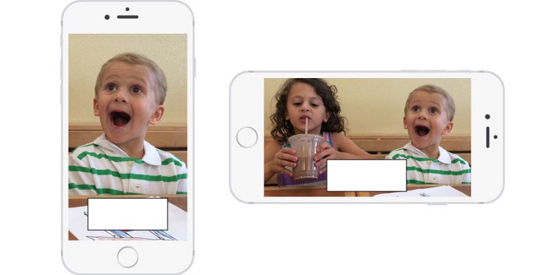
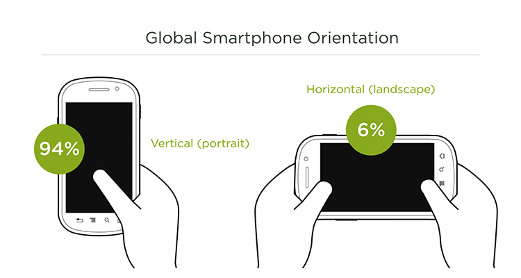
According to Luke W, mobile phones are used in portrait orientation 94% of the time; This means all content (including video) should be adapted for this orientation.
Scenarios
Technology ignores everything we know about how great conversation works. The idea, in theory, is that it makes it possible to focus on the person speaking. But it also rewards the loudest person in the room.
This reward-the-loudmouth design ignores everything we know about how truly great conversation works. Rich conversation thrives on what’s known as “turn-taking,” with the group fluidly moving its attention from speaker to speaker. In FaceTime and Hangouts, the people in the group don’t have any control over where they put their focus. That’s determined automatically by the software.

Many individuals watch videos while on public transportation, which can cause several issues. Users who are deaf or hard of hearing can have their viewing experience enhanced in several ways (HOH). Further investigation indicated that discrimination is not limited to a particular set of characteristics; for example, the audio-heavy experience was inaccessible to deaf users (ability-based exclusion).
A user study showed an overlap between pain points and user requirements caused by situational and ability-based limitations. This meant those watching videos in noisy places like airports, or cafes may benefit from solutions initially developed for the hard-of-hearing community.

To enable users who are deaf or HOH and people at loud airports/cafes to access video content, a full transcript allows for quick skimming and closes captioning provides real-time translation of the audio content — this offers different ways for users to engage with the same content. The subtitles can be made to appear/disappear.
However, let us remember my grandma, who is fantastic with her ears but not with her eyes. What about her? How about some useful UI?
First, you must consider what should produce sound in your app and why? The most important thing here is to do just what is necessary. You do not want your app to sound like a slot-machine club during busy hours.
Whenever you add sounds to an event, asking yourself, “Do I need a sound here?” would be a good idea. It is essential to understand the function of each sound component and remove whatever you do not need. Only the sounds that provide helpful information or improve the user’s experience should stay. This is further discussed in The Role of Sounds in UX.
Chatbots As Assistants Integrated with Video commerce.
We won’t see chatbots as a complete replacement for regular GUI experiences, but they will be integrated into messaging platforms (such as Facebook Messages) to serve as assistants. Businesses will have real-time automated conversations with their customers.
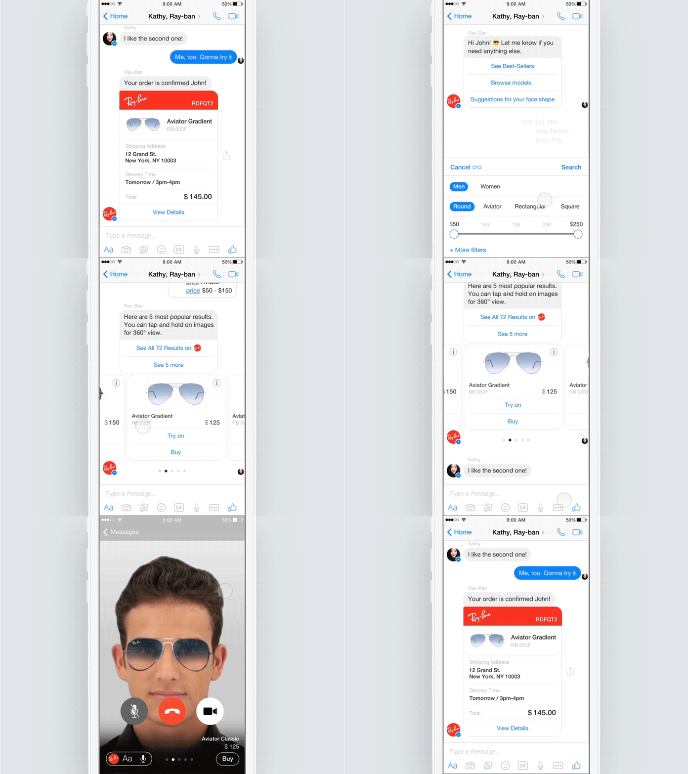
Putting it All Together
Many on the Internet hate vertical video. To self-righteous denizens of Reddit and YouTube, people who shoot mobile videos in portrait mode — think skinny and tall video rather than the widescreen format normalised by movies and television — are uncouth amateurs.
Thanks to apps like Meerkat, Twitter-owned Periscope and Snapchat, the media industry is beginning to take vertical video seriously. Snapchat told the Daily Mail, a Snapchat Discover content partner, that vertical video ad have up to nine times more completed views than horizontal video ads, according to Daily Mail North America CEO Jon Steinberg. That’s because vertical video delivers better results than standard video in environments where people hold their devices upright.
However, Digiday predicts that the tide may be turning in favour of vertical video. One reason cited in the article, and that I’ve experienced IRL is that shooting vertically is more ergonomic and simpler to do with one hand. As devices get more extensive, holding the phone with one hand becomes increasingly unwieldy and more likely to be passed over.
But when you consider that consumers hold their phones vertically 94% of the time, the whole vertical thing starts to sound slightly less crazy…
If It’s time to take vertical video seriously and Why Vertical Video is the Future needs a different article to discuss, I will present here both options.
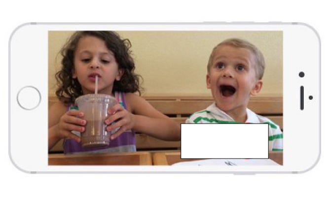
So far, all video products have trained us to aim for function consistency when we rotate the device. As screen size has increased, this flaw in thinking has been exacerbated.
This small button move would allow users to hold the phone comfortably with one hand while pressing the record. Take it a step further and give them the ability to indicate which hand they’d like to use
Although I am stuck between the reality of text versus content, I will always like a balance of both; half screen video, half-screen text…
Something like this on the right side of the image:
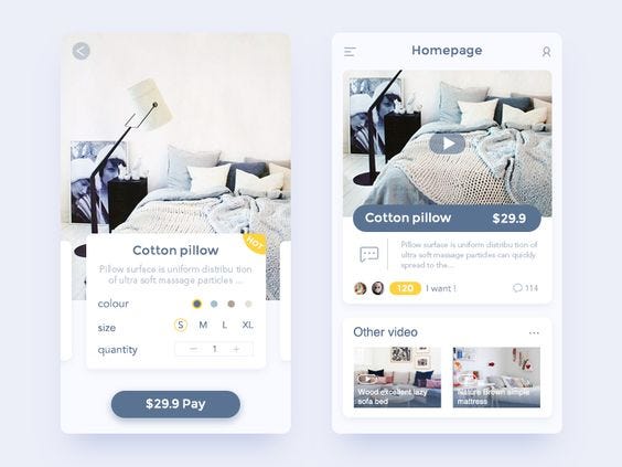
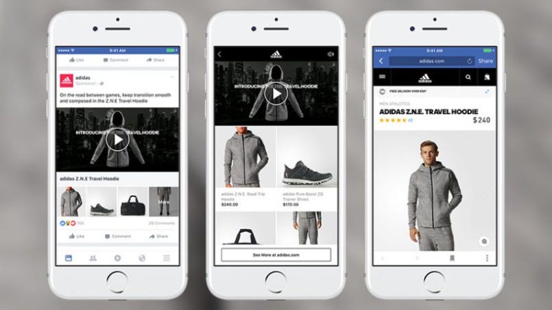
Although I like how Facebook balances the videos and content with its existing UI and generates revenue, the users are curiosity-driven, which works for both vertical/horizontal videos.
Or a balance where the user decides when to watch a video and when not? Users should easily access information, see product tests that would be hard to try at home, and ask for requests the provider could try on the spot. This amount of information sharing and gathering could provide a massive boost in converting viewers to customers.
A 100% video commerce app is not a feasible option now. However, India does have some internet issues. With key players like Vodafone, Airtel, Jio etc., giving almost free Internet (or fixed daily quota), most of the Tier 2 population still has an average internet speed, and the videos do buffer here. India is ranked 67th for fixed broadband and 109th for mobile internet speeds in February, according to internet speed testing analysis firm Ookla. Read more.
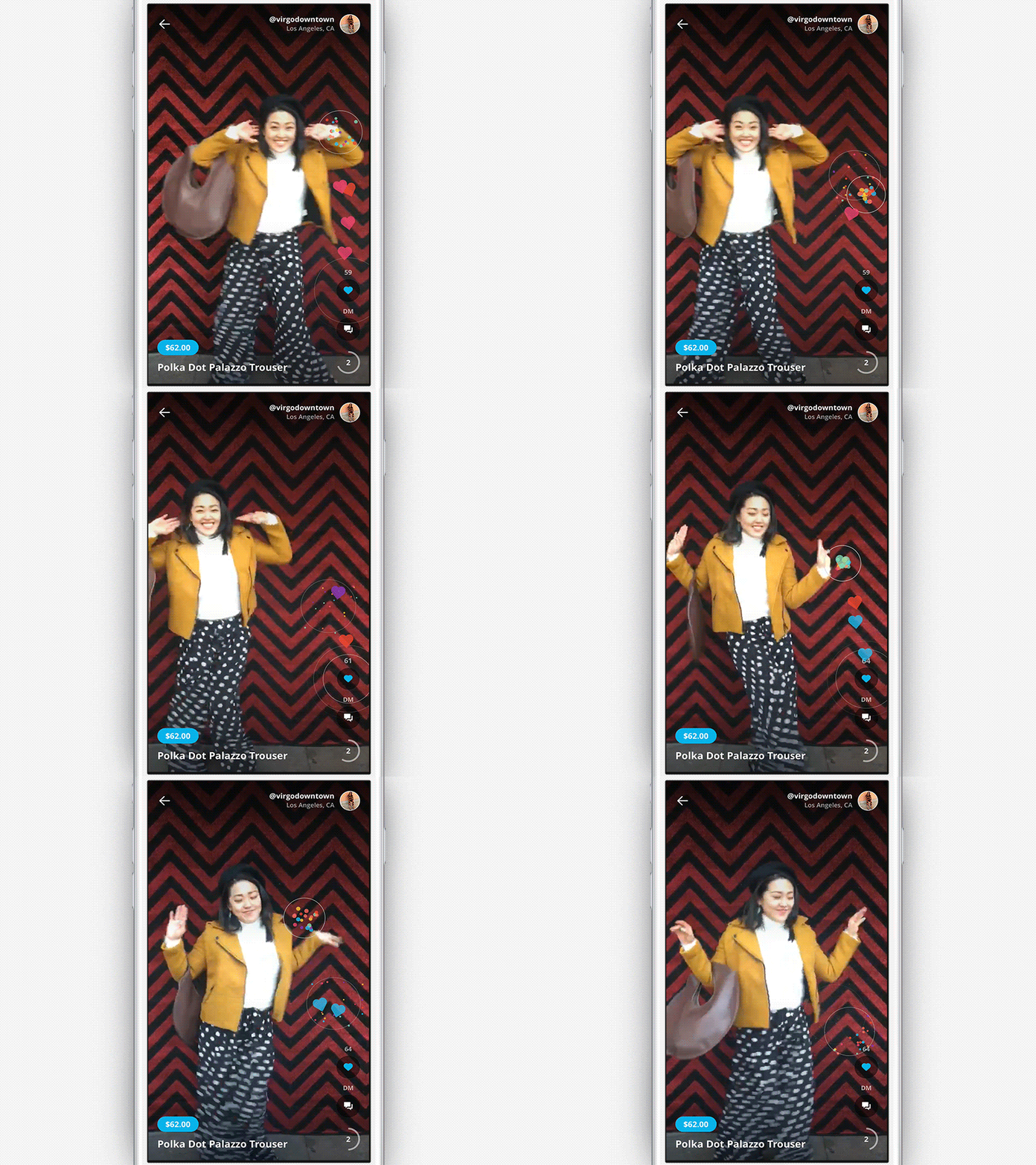
I hope you found this interesting. Do share your thoughts. Here’s a little clip from the video-selling platform Kernl.
I am text block. Click edit button to change this text. Lorem ipsum dolor sit amet, consectetur adipiscing elit. Ut elit tellus, luctus nec ullamcorper mattis, pulvinar dapibus leo.
Use this easy checklist to ensure a smooth design handoff
When a design cycle is complete, all implementation details must be communicated to the development team. The design handoff describes this procedure.
A standard part of this handoff is the exchange of links to various digital assets. The nature of your business will determine the nature of the deliverables you provide. Typically, you will receive a mix of the following when purchasing a digital product:
- The user takes action. It depicts a user’s actions with the product to accomplish a goal. Helpful for verifying our edge case handling and determining which elements link to which.
- Specifications for the display. Everything that has to do with screen pixel art. Utilised by programmers to ensure the finished output follows your designs.
- Assets and moving pictures. While the specifics will vary from process to process, this typically includes delivering high-resolution photos or JSON files.
- Prototypes. They show a developer how you want the final product to behave and are sometimes made for purposes like user testing.
Because of its potential impact, a design document warrants special care. This procedure can be streamlined significantly with the help of current design tools like Zeplin and Figma. But, designers still need to make an effort.
All hail the design doc
Many of the tasks that product managers and developers perform are already well documented. They do this so everyone may work off the same facts. The same holds true for designers.
A design document’s usefulness extends much beyond that of a mere source of information.
- Exhibit your wares. All the hard work behind the doors, from competitor research to usability reports, may be made public.
- The evolution of the log format. Including meeting notes from design reviews helps explain the thought process of making specific design choices.
- Establish a repeatable procedure. The consistent use of a plan of action for all your projects will force you to evaluate your methods. It serves as a benchmark against which your actions can be evaluated.
- Create a benchmark for good design. A design document is just another design deliverable if everyone on the team uses it. You may confidently onboard a new designer by directing them to all your lovely design documents. Others around you will have a firm grasp on what kind of behaviour to anticipate from you.
Sending an Invison link via Slack differs from writing a short design document by hand. How you present your work to others reflects poorly on you and your design team. It’s always beneficial to put in the extra work.
Tips for improving your design handoffs
Our processes as designers are distinct from those of coders.
Transfers should be mutually beneficial. If you want things to go well, consider the developers and product managers using your design document.
Pay attention to detail
Being thorough when producing final deliverables will help you avoid unnecessary back-and-forth, which can be annoying.
The time spent fixing mistakes after a handoff can add up quickly. Is it normal to inquire about something that seems obvious but may not be to developers?
- Verify that your connections work. Nothing is more frustrating than trying to access anything online only to discover that the link you tried to access is no longer active. Please don’t be the one to bring this on. Before submitting your paper, ensure all the links are open in separate tabs.
- Maintain an orderly aesthetic in your designs. Correcting little errors like misspellings can have a considerable impact. Your packaging should be given the same care as your designs. Only tell your team about it if you’d be willing to claim it as your own.
- Just check everything over! Verify your flows’ reasoning, ensure you have the required resources and account for every possible scenario. Your team will take whatever you say at face value, so make sure it’s accurate.
- Speak firmly and unambiguously. Without clear and precise documentation, your developers will have questions. Maybe they’ll hazard a guess that turns out to be entirely off base. Time spent correcting mistakes is reduced in proportion to the clarity of your detailing.
Think about their experience
Our processes as designers are distinct from those of coders.
Transfers should be mutually beneficial. If you want things to go well, consider the developers and product managers using your design document.
- Please be explicit. Make sure the layout of your document is appropriate for their needs. Everybody who visits your doc searching for a particular thing should be able to locate it without any trouble.
- Inquire of them. You should coordinate your efforts with them to determine how to speed up your team’s workflow. To a certain extent, every squad has its own identity. Learn who yours is.
- Observe their efforts. Because of how well we know our equipment, we tend to favour it. Share with your developers any keyboard shortcuts you’ve learned that have streamlined your use of a particular programme.
Keep your finger on the pulse
Immediately diving into the next project after a handover is appealing.
Going AWOL and making a snap decision in this state might be risky. Be there and be encouraging.
- Show up for review meetings. Observing the final working product lets, you learn how developers interpret your design documents.
- Don’t close your mind. Developers’ recommendations to alter the design occasionally make it into production. There are several possible explanations for this, and we need to hear them out. We don’t act as filters. It’s OK if others with more knowledge than us alter our designs.
- Keep your word. Developers will start implementing your plans when you hand off your work to them. The onus is on you to step in and assist them if you need to remember something. A blocked worker with a strict work schedule will cause problems for everyone.
Be an asset to your team
You are needed.
Nothing is more important than having a positive team-player mentality, regardless of how talented a designer you may be.
- Take on a pleasant demeanour. An offensive designer is universally reviled. Act in a way that makes people feel safe talking to you about anything they think. Even if you disagree, you should try to get along with them.
- Do what you can to assist. Do what you can to assist the team, even if it’s outside of your job description. Wrapping loose ends is even more important than handing off the design doc.
- Try to maintain an attitude of hunger and curiosity. The best designers are those who are well-rounded in other areas as well. You will develop empathy and become a more skilled designer if you take the time to learn about other people’s processes.
- Collaboration is essential in the design and construction phases. As the final gatekeeper before your designs reach the consumer, ensuring that the developers correctly implement them is in your best interest. This is why hangovers play such a crucial role.
Individuals within your product team are the target audience for any internal documentation. Remember their wants and desires, and provide them with a solution that improves their quality of life. If you do a good job, members of your team will go back to your design document time and time again, which will have an impact on how they go about their day-to-day tasks.
The incredible power of Zero-UI technology
For better or worse, much design work is still visual these days. This makes sense since the essential products we interact with have screens.
Television introduced us to screens in 1938 for the first time. Ever since, our world has been flooded with Computers, iPods, smartphones, tablets… and more and more types of screen-based devices.
Hence, today only a minute goes by without interacting with a screen.
The Internet of Things, coined by Kevin Ashton in 1999, surrounds us with intelligent devices. In 2020 more than 10 billion devices were already connected to the Internet — and by 2025, this amount is expected to double up to 20 billion.
So, knowing that intelligent machines can hear our words, anticipate our needs, and sense our gestures, what does that mean for the future of design, especially as those screens go away?
Let’s discover together what this so-called Zero-UI stands for.
What is Zero-UI?
It isn’t a new idea. I bet you are already familiar with it.
Zero User Interface, or Zero-UI, is an increasingly popular concept first coined by designer Andy Goodman, formerly at Accenture Interactive’s agency.
Have you ever used an Amazon Echo, talked to your iPhone using Siri, or skipped a song, double-tipping your AirPods? Then, you’ve already used a device that could be considered part of this so-called Zero-UI concept!
It is about getting away from the touchscreen and interfacing with the devices around us more naturally. This includes different fields such as haptics, computer vision, voice control, and even artificial intelligence.
Why do we need this transition?
It is aimed to allow more natural interactions when compared to screen-based devices.
To understand the need for this transition let’s look at how we currently communicate with technology to understand the need for this transition. Most of us interact with our devices daily through a Graphical User Interface (GUI).
A GUI interface allows users to interact with electronic devices through graphical icons and visual indicators. It can be a displaying screen — for computers — or a touchscreen for any phone or tablet. Thus, users must still use a mouse and keyboard combination or tapping and swiping to transmit information.
If you look at the history of computing, starting with the jacquard loom in 1801, humans have always had to interact with machines abstractly and complexly.
— by Andy Goodman.
Interfaces have come a long way from their humble origins, but they still need to provide the best experiences for those who use them. We download an endless amount of apps and click through too many screens in an attempt to perform daily tasks.
Luckily, designers and developers are addressing the issue to bring forth some exciting changes to help out with this problem. Just like computers evolved from being used via running code in a terminal to having a friendly and intuitive graphical interface, the next natural step has no interface.
Today, machines still force us to come to them on their terms, speaking their language. The next step for electronic devices is to finally understand us on our terms, in our own natural words, behaviours, and gestures.
This is precisely where Zero-UI appears. It is aimed to allow more natural interactions when compared to screen-based devices. At the helm of this transition are both gesture-based and voice-recognition user interfaces.
According to Dharmik, the gaming world has been one of the first to adopt gesture controls to provide a more natural user experience. The Nintendo Wii console was launched in 2006 and contained gesture-based controllers or later models. You can watch the revolutionary launch of Wii advertising below!
Launching advertising of Wii.
The world has fallen for the charm of this so-called Zero-UI, which will not likely change.
Voice recognition is another common Zero-UI feature found in our daily life. During the 2000s, Google launched Google Voice Search. Until Alexa was first released in 2014, voice recognition experienced a commercial explosion. Ever since, more than 312 million Alexa devices have been sold. Amazon is expected to overpass this amount by 2025: 320 million are expected to be sold.
How will Zero-UI change the design?
This technology does — and will — create a massive effect on society.
According to Andy Goodman, Zero-UI represents a whole new dimension for designers. He compares the designer’s leap from UI to Zero-UI as just designing for two sizes to thinking about what a user tries to do in any possible workflow.
Instead of relying on clicking, typing and tapping, users will now input information utilising voice, gestures, and touch. Interactions will move away from phones and computers and into physical devices. We will communicate instead.
The most important — and revolutionary — part of this concept is that it can be used for cities, homes, ecosystems, and personal devices.
Different Types of Zero-UI
There are various ways to communicate with current technology instead of relying on a visual screen, which can be used to achieve this desired Zero-UI.
Voice Recognition and Control
It’s a process where software or device identifies the human voice, understands some instruction, and performs a particular action accordingly. When a user asks a question or gives a statement to the software, the tool recognises and reacts to the user’s query.
The best examples of voice recognition and control are Siri and Amazon Echo.
Haptic Feedback
Haptic Feedback facilitates users with vibration-based Feedback. Even though we are already used to it when interacting with our phones, it is an integral part of wearable products such as fitness trackers and smartwatches as they enable users with notifications. It is also an essential feature for current game controllers — you can notice someone attacking you before seeing it on screen.
In the coming future, it will also be available with intelligent clothing.
Gesture-Based User Interface
It is one of the most natural ways of interaction. The gaming world first adopted this concept. It allows users to incorporate more motion and physical space properties than just button-based commands. The best examples of a gesture-based user interface are Microsoft Kinect, Think Wii, and PlayStation Move.
Google’s Project Soli.
Google has also released a gesture control product Project, Soli. A sensing technology detects touchless gesture interaction using a small radar.
Context Awareness
Contextually aware apps and devices facilitate users with a more simplified physical and digital experience by anticipating their needs. It eliminates all additional layers of interaction.
The AirPods are one of the best examples. By introducing sensors into a device or location data, we can design next-generation contextual experience that offers more implicit interaction rather than explicit.
These are some of the most common — and already working — ways to communicate with technology. Upcoming times will introduce breakthrough devices with these outstanding capabilities and even more.
Zero-UI will rely on Data and AI.
As we move away from screens, many of our interfaces will have to become more automatic, anticipatory, and predictive.
Whereas interface designers right now live in apps like InDesign and Adobe Illustrator, the non-linear design problems of Zero-UI will require vastly different tools and skill sets.
Designers will have to become experts in science, biology, and psychology to create these devices… stuff we don’t have to think about when screens constrain our designs.
— Andy Goodman.
One clear example would be designing a TV controller. Depending on who is standing in front of that TV, the gestures it needs to understand to do something as simple as turn up the volume might be radically different: a 40-year-old might twist an imaginary dial in mid-air, while a millennial might jerk their thumb up.
What’s after Zero-UI?
Zero-UI is the ultra-modern version of artificial intelligence.
Zero-UI is meant to allow users to experience more human-like interactions. Soon Google Assistant, Siri and Alexa will become the memories of the precious past of the tech world.
Looking to the future, the next big step will be for the concept of the ‘device’ to disappear.
— by Sundar Pichai, Google C.E.O
How Visual Design Contributes to an Engaging UX
Don Norman writes about the research in his book Emotional Design: Why we Love (or Hate) Everyday Things, where he found that “…the degree of system’s aesthetics increased the post-use judgements of both aesthetics and usability, although the degree of actual usability had no such effect.”
To rephrase, aesthetics have as much of an impact on the user experience as functionality. The idea that visual design could be more important than usability doesn’t sound right. It shouldn’t surprise us. Humans are attracted to things and people who find them attractive. Apps and sites are more likely to give a beautiful application the benefit of aesthetics.
What is the attraction?
That is to say; it’s an unanswerable question.
Before we can discuss the aesthetics of the user interface, a question must be answered. Has the term “objectively appealing” ever been defined? As defined by Pythagorean believers, beauty is “a manifestation of harmonious, mathematical relations such as the golden section,” an issue philosophers have debated since at least Pythagoras. Many researchers and philosophers attempted to quantify beauty’s value in the years after that.
In the eyes of some researchers, the things that appeal to our sense of beauty also happen to be healthy. Hence, we find healthy people “unattractive,” while we find aesthetically beautiful things like berries because they suit us. Although that hypothesis has significant flaws (see the attractiveness of toxic frogs), it may have some validity.
On the other hand, many believe beauty is a product of cultural norms. Consider that most American kids watch Disney movies at an early age, teaching them that villains and bad guys are ugly, but heroes and good guys are attractive. The media we consume daily form our perceptions of what is considered attractive here and now; nevertheless, in 10 years, many articles of clothing, styles of facial hair, and even body types that are considered attractive today will seem laughable and sad. The standards of beauty that a society holds vary as its values evolve.
Well, let’s apply that to user experience design. Some appealing interface or site structure features may be those we naturally identify with ease of use. Web design ideas and graphic elements that seem alluring today may have lost their lustre a few months or years ago. There was a time when comic sans were the standard, and flash splash pages were the mark of a well-designed website.
Alternatively, Voltaire believed that beauty cannot be defined, which may have inspired the idiom “beauty is in the eye of the beholder.” In the eyes of empiricists, beauty merely reflects the person who finds it attractive and shares similar qualities with pleasure.
Visual Design in UX
We may now explore the function of visual design in UX with the realisation that there is no single “absolutely beautiful” aesthetic. After all, there’s more to it than just aesthetics.
One can’t just compare graphic design and interface design. According to Usability.gov, visual design is the “strategic implementation of images, colours, typefaces, and other aspects” to improve a design or interaction and pique users’ interest. Interaction design concerns how well a product or service helps users complete a specific job. The visual design captures consumers’ attention by leading them to the appropriate functionality, prioritising tasks on a page through size, colour, and whitespace, and even boosting brand trust through visual cues.
Visual design is an increasingly popular field combining graphic and UX design elements. Graphic design is often the design of static images or visuals, with the proviso that these fields are ever-evolving. The visual design is quite balanced, including static images and visuals to enhance communication and usability. As a result of its incorporation of interaction and user interface design, user experience design emphasizes open lines of communication.
Users’ perceptions of a screen’s contents can be profoundly influenced by its aesthetic design (pun intended). Consumers have grown accustomed to the idea that aesthetically pleasing screens have higher utility, usability, and humanity levels.
The Correlation
The user’s experience can be altered by changes made to the visual design.
Google’s Director of Product Management, Luke Wroblewski, has devoted most of his career to studying the links between aesthetics and behaviour. His 2008 talk, “Communicating with Visual Hierarchy,” elaborates on the significance of visual design in user experience. To paraphrase, he claims that the following are aided by the use of visual hierarchy:
- communicate messages,
- illuminate actions, and
- organise information.
He offers a wealth of advice to help designers think critically about where and how they present data. A visually appealing hierarchy is also an easily navigable one. Still, little has changed in the seven years since then about how little attention is paid to visual design in UX.
A definition, please. Is there such a thing as objective beauty, or do some people find Microsoft aesthetically pleasing? Or is aesthetic appeal a luxury rather than a prerequisite? The user’s experience can be altered by changes made to the visual design. But it’s optional to get the job done. Users’ opinions of it will always be inextricably linked to the product’s success. Indeed, but how so? It is the million-dollar question.
Visitors will give an unsightly site the benefit of the doubt if their experience is positive, much like they might with a well-dressed job candidate at an interview. Users are more likely to give a site a second opportunity if they find it aesthetically pleasing, whether through more “conventional” design elements or more “intelligent” ones.
What does it mean for UX Designers?
You can only rely on something other than aesthetics to redeem a dreadful encounter.
Features or functionality appropriate for the user or poorly created can only be improved by the most appealing aesthetics. And remember aesthetics! There is rivalry in every industry, and good graphic design can help customers choose your app over others that provide similar features.
For aspiring user experience designers, here is a best of:
- Stay consistent. Inconsistency may ruin even the most stunning aesthetic. In this case, a person’s emotional reaction to the site’s design will directly impact their perception of its aesthetic appeal.
- Test visual concepts as well as paper prototypes. Visuals have a powerful effect on us, and effective branding may persuade us to trust and engage with a company. People often say they are “looking” at a website when actually “interacting” with it.
- Stay focused on trends. For a good reason, a little black dress has been a staple in women’s wardrobes for over a century. Simply put, it’s easy. It needs to be more spotless. That’s a timeless piece, for sure. A straightforward, clean, and classic aesthetic will also outlast fleeting fashions. Certain features of flat design (for example) are likely to be around, but many apps are predicted to appear “so 2015” in a few years.
Stop using Dribbble & Behance to find practical design inspiration
Ignore Dribbble and Behance as sources of design ideas. Check out these resources instead.
As designers, we monitor the industry for emerging styles and developments. To achieve this, we frequently look to the work of other designers for guidance.
Nevertheless, only some of the designs on Dribbble don’t solve UX concerns, which is one of the most significant issues with using Dribbble as a source of ideas. The designs seen on Dribbble may be lovely, but they must still be practical or even address actual issues.
Our designers are responsible for producing aesthetically pleasing, practical work and effectively resolving real-world issues. Nonetheless, Dribbble tends to emphasise form over utility. As a result, you may want assistance in implementing the solutions proposed by the ideas you discover on Dribbble.
Following these steps increases the likelihood that the ideas you draw upon will be suitable for solving your design problems. You may receive fresh ideas for user interface design from sites like Dribbble and Behance. Dribbble and Behance may not be ideal if you’re interested in usability, UX, and aesthetic appeal. Hence, designers should hunt for inspiration somewhere than Dribbble, namely in utilitarian designs that address real-world issues.
These are some things to remember when you search for real-world design projects to inspire your own.
- Compliance with the UX rules in design. While brainstorming new ideas for design projects, it’s helpful to consider how those laws may be used. By studying existing designs that adhere to UX rules, you can ensure your creations are practical and easy to use. As a result of considering the user’s actions and preferences, designs that adhere to UX rules are more successful and popular.
- Although aesthetics play a significant role, a design’s viability depends on whether it accomplishes its intended goal (either addressing a real problem or satisfying a genuine demand). Designs that address actual needs are another critical criterion for evaluating motivation. Find challenges you’d like to solve and draw inspiration from ideas that do just that.
- Designs that have already undergone extensive development and consideration are also essential. To create something valuable and practical, it’s best to model it after existing designs. Looking at concept designs for ideas is beneficial, but you must also consider how the concept might function in practice.

For those of you looking for simple ideas for your projects, I have compiled a list of over twenty websites that you might peruse.
Check out the websites below and bookmark this post since they cover a vast database of items. I've been looking for previously produced and released things through these platforms. All right, let's get started.
Pagecollective

This is a great place to find ideas for both websites and their individual parts.
Best Website Gallery

Collection of top-voted websites that can be filtered by various web frameworks.
Appshots

Newest designs for mobile apps, hand-picked by an expert curator. (Used as a model for many successful mobile applications)
Designers must go outside their field for ideas to stay relevant and produce unique and functional designs. Diversifying your inspiration sources is vital rather than relying on sites like Dribbble. Original, imaginative, and designed following UX standards that answer actual problems are more likely to be seriously considered. Considering these points will increase the likelihood of the ideas being helpful and usable in design projects.
A Guide to Evaluating Design Projects
It’s essential to know the difference between constructive criticism and personal opinion when providing feedback to a designer. Providing constructive criticism requires effort. The “does it look attractive” and “does it make sense” questions are rarely sufficient. I have a history of providing constructive criticism to my coworkers and the junior designers I mentor.
Knowing what aspects of your design you’d like comments on is also helpful. As I’ve mentioned, the quality of the responses you receive will increase if you provide more detail about your needs.
Having someone email me a design for approval without providing any context for my input is the most annoying thing that can happen. In this piece, I’ll discuss the criteria I use to evaluate designs and why I consider them crucial.
Functionality
Interfaces need to serve more than one purpose when being designed.
They should be logical. Those that use your creations will be doing so to fulfil a need. Usability heuristics provide a framework for UX designers to analyse their work and make improvements. A checklist is a quick and easy way to ensure all the essentials have been addressed.
Knowing that your design at least considers these elements is essential to me.
- Usability. Is the method apparent for carrying out the desired task? What options do I have if I need to correct something? How can I know whether something I do will work or if there is an issue, even if I do it correctly?
- Copy. Are you using simple language that is easy to understand? How professional do you think your tone is? Could someone who wasn’t familiar with the field read it and comprehend it?
- Scope. Does what you’ve created fit the criteria laid out in brief? Do you have features that overcomplicate things when they aren’t necessary?
- Specification. When I look at your design files, how much do I learn about the inner workings of the design? Where it was necessary, have you included annotations and clarifications? Tell me about the interconnection of your various displays.
Feasibility
Your design must be practical if you're making something others will construct
A developer needs to look at the designs you send them and be able to use them. Many designers I’ve talked to have told me that interacting with developers is a significant source of stress for them. Finding a happy medium between what we design and what is built can be challenging due to misunderstandings and competing priorities.
Keeping the developers in mind while designing can help ease this pressure.
Something like this is what I’m after personally:
- Layout. Does the layout follow a grid, and is everything in its proper place? Are the constituent parts of your layout readily identifiable?
- Use of a consistent style. Is there a distinct order to the fonts? Do the hues all match up with what has been established?
- Flexible layout. Have you specified how the design should behave when seen from various gadgets? Just where are the tipping moments, exactly?
- Interactions. What happens if you tap, drag, or hover over specific components? Which special effects and animations might I expect to see? If they’re not worth it, why include them?
It’s more complicated to construct a workable UI; you’ll need to be familiar with the principles of how a developer thinks to do it right. If you are interested in learning more about coding, I have produced an essay that may be of assistance to you.
Familiarity
There needs to be more flux in terms of design norms.
Although design patterns are constant, they are occasionally disrupted by novelties such as dynamic islands. And rightly so. People are resistant to change in technology. When a significant corporation changes its user interface, you should expect an avalanche of complaints.
People have preexisting notions of how interfaces ought to function in their heads. What they’ve seen before has conditioned their thoughts and actions. As a user experience designer, you should cater your creations to your users’ prior knowledge and experiences.
How we construct hyperlinks is an excellent illustration of how familiarity is crucial. Looking at a webpage, it should be reasonably obvious which elements can be interacted with by tapping them. You can make an educated guess, at the very least. As the underlined text is typically a clickable link, you know this is one.
It doesn’t mean we can’t take some liberties with the rules. Other iterations of this pattern can arise from time to time, such as underlines that only show up when you hover. Alternatively, the text may be a contrasting colour. Yet, in general, it’s easier for people to pick up and implement your idea if you stick close to what’s already in the regulation.
Flexibility
As designers, finding the sweet spot where form and function coexist is our job.
You’ll find examples of flawless, aesthetically pleasing user interfaces in a designer’s portfolio. Things look nice there, but that finished product will function differently. Designing a universally flawless display is impossible. Hundreds of screen sizes and resolutions can be used for tablets and PCs. It’s possible to choose from various phone models, each offering features and personalisation options.
If we want as many individuals as possible to benefit from our products, we must ensure our solutions are as versatile as possible. The effectiveness of your design in the following contexts would be on my mind:
- Responsive. Using a mobile device against a computer at a desk. Do you use a responsive layout, or does it only function properly on a specific screen width?
- Translation. Would the length or width of your text blocks cause problems with the layout?
- Colours. What if they are colourblind or using a blue light filter? But what if they’re in dark mode?
- Interactions. Will someone using a keyboard be able to get around your layout quickly? Does a touchscreen require anything special to operate? Or using only one hand to gesture?
- Weight. If your internet speed is slow, how long will this take to load? Is there any movement or extensive photos that could bog down older or less powerful gadgets?
This vast arena and I’ve barely scratched the surface here. Neither accessibility nor a responsive design expert, but I can get by. By deliberately trying to damage your designs, you may determine whether or not they are robust enough to be used successfully in various contexts.
Finesse
To a large extent, developing an appreciation for aesthetics is a matter of practice.
To master something requires lots of time spent doing it wrong and learning from those mistakes. You can’t hasten this process.
Earlier in my career as a designer, I frequently spent hours researching competing digital offerings in search of ideas. I’d re-create them to determine their secret to success, then use that knowledge in future projects. The present-day me is just as guilty of this.
You can find helpful articles with general UI advice or follow industry leaders if you want more inspiration. Online, you can also find advice from numerous professionals in the design field. No amount of theory or research will replace actual hands-on experience, though.
While evaluating the aesthetic quality of a design, I keep an eye out for the following details:
- Typography. Do the typefaces you’ve chosen complement one another? What do you think of the spacing between words? Can you identify a specific level of superiority among the styles?
- Consistency. Are all the pages using the same design and concept?
- Aesthetic. Do you find the colour scheme to be aesthetically pleasing? Do you have high-resolution images and diagrams?
- Careful focus on specifics. Is there symmetry and uniformity? Did you find any grammatical or spelling errors? Is there a sense of disorder or chaos in the layout?
In my experience, there is no such thing as a flawless design. The more you think about your work, the more flaws you find. On the contrary, I enjoy being in that state and understanding what needs to be adjusted and why it can help you make design decisions that make a difference.
